

What Is a Curated Color Palette And Why It Changes the Entire Feeling of a Home
Most people think a color palette is simply a list of paint colors.
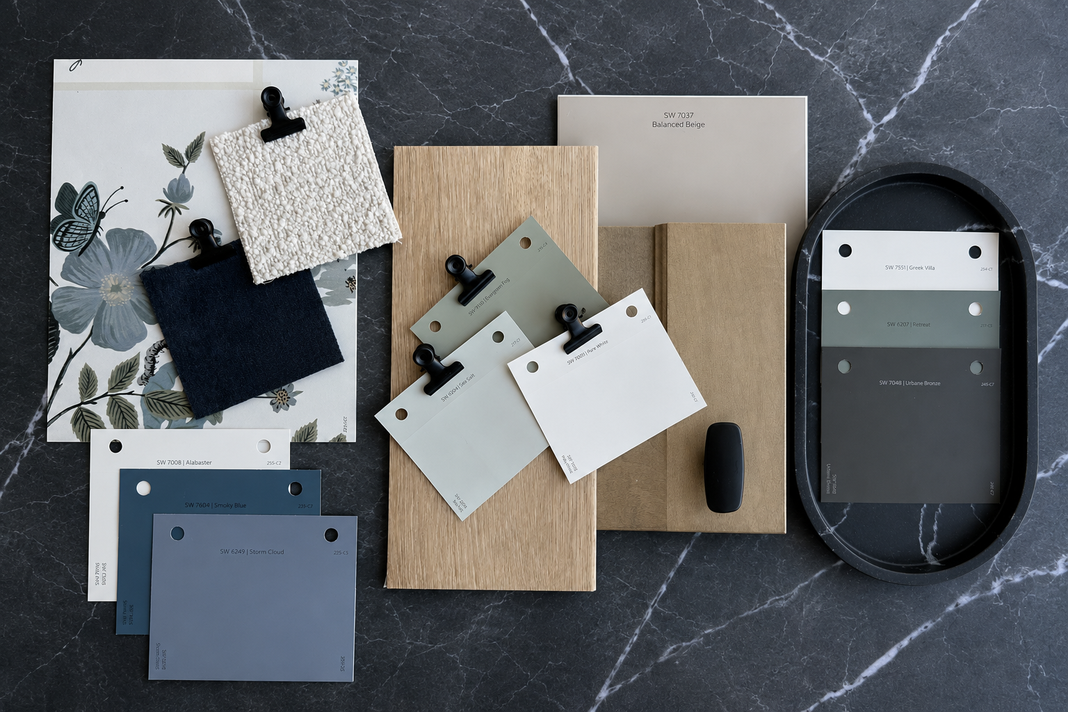
But a truly curated color palette is much deeper than that.
It’s the invisible thread that quietly connects a home together — the thing that makes spaces feel intentional instead of accidental, calming instead of chaotic, elevated instead of unfinished.
You may not immediately notice it when it’s done well.
But you always feel it.
A Curated Palette Creates a Sense of Continuity
One of the biggest reasons homes feel visually overwhelming is because every room is often treated like a separate project.
A homeowner chooses a white they like for the kitchen.
A gray for the hallway.
A green they saw online for the bathroom.
A trendy color for the bedroom.
None of the choices are necessarily bad.
They just were never designed to live together.
A curated color palette solves that problem by creating connection between spaces — not just within them.
The home begins to feel fluid rather than fragmented.
The Goal Is Cohesion — Not Perfection
Curated color doesn’t mean your entire house has to look identical.
In fact, some of the most beautiful homes use contrast, depth, and variation intentionally.
The difference is that the variation feels controlled.
The tones relate to each other.
The undertones support one another.
The transitions make sense.
Instead of every room demanding attention individually, the home begins to tell one complete story.
Color Is Constantly Interacting With Everything Around It
This is the part most people are never taught.
Paint colors do not exist on their own.
They react to:
Flooring
Cabinetry
Natural light
Tile
Furniture
Metals
Shadows
Adjacent paint colors
Time of day
A color that feels soft and warm in one room can suddenly feel cold, green, pink, or overly yellow in another.
That’s why selecting paint one room at a time often creates subtle tension throughout a home — even if the homeowner cannot immediately explain why something feels “off.”
Curated palettes are designed with those interactions in mind from the beginning.
A Well-Curated Home Feels Easier to Live In
When the foundational colors of a home work together, everything else becomes simpler.
Decorating feels more natural.
Furniture selections feel less stressful.
Textures layer more beautifully.
Accent colors feel intentional instead of random.
Even small things begin to feel more refined because the visual foundation underneath the home is supporting everything else.
The home stops feeling like a collection of separate decisions and starts feeling designed.
Curated Color Has Less to Do With Trends — And More to Do With Atmosphere
Trends change constantly.
But homes that feel timeless usually share something much more important:
they feel balanced.
The colors aren’t screaming for attention.
The contrast feels thoughtful.
The undertones feel aligned.
Nothing feels overly harsh or disconnected.
That sense of balance is what creates warmth and comfort over time.
A curated palette is not about chasing what is popular.
It’s about creating a home that continues to feel beautiful years later.
What Actually Makes a Palette Feel Curated?
A curated palette is built intentionally around the home as a whole.
That often includes:
Consistent undertones
Balanced contrast
Coordinated neutrals
Purposeful accent colors
Natural room-to-room transitions
Consideration for lighting conditions
Colors that support the architecture and finishes of the home
Every selection has a relationship to the next.
The Difference Is Usually Felt Before It’s Seen
Most people walk into a cohesive home and simply describe it as:
calming
elevated
welcoming
warm
intentional
They may not immediately identify the reason why.
But often, color flow is doing much of the work behind the scenes.
Because when a palette is curated thoughtfully, the home feels visually quieter.
More grounded.
More connected.
A home does not need dozens of trendy colors to feel interesting.
It needs balance.
Depth.
Flow.
Contrast used with purpose.
A curated color palette creates the framework for all of it.
Not by forcing every room to match — but by allowing every space to belong together in a way that feels effortless, layered, and timeless.