

Inside My Process: How I Build a Palette
One of the questions I get asked most often is:
“How do you actually choose colors that work together?”
And the truth is — I don’t start with trends.
I don’t start with Pinterest.
And I definitely don’t start by picking random paint chips in a store aisle.
Every palette I build follows a process.
Because a beautiful color on its own doesn’t automatically create a beautiful home.
At Eastman Design Co., the goal isn’t simply selecting paint colors — it’s creating a home that feels connected, intentional, layered, and timeless.
Here’s a look inside how I build a palette.
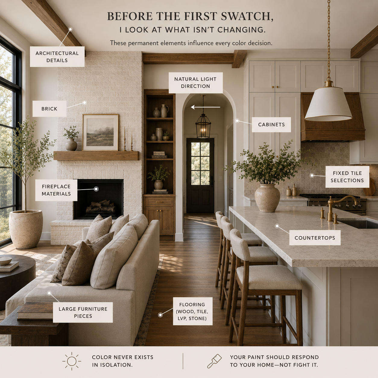
Step 1: Start With What Isn’t Changing
Before I look at a single paint swatch, I look at the permanent elements.
These are the pieces that already exist and will influence every color decision:
Flooring (wood, tile, LVP, stone)
Countertops
Cabinets
Brick
Fixed tile selections
Fireplace materials
Large furniture pieces
Architectural details
Natural light direction
Most people skip this step.
But color never exists in isolation.
A warm white against red oak floors behaves differently than that same white against cool gray flooring.
Your paint should respond to your home — not fight it.
Make it stand out
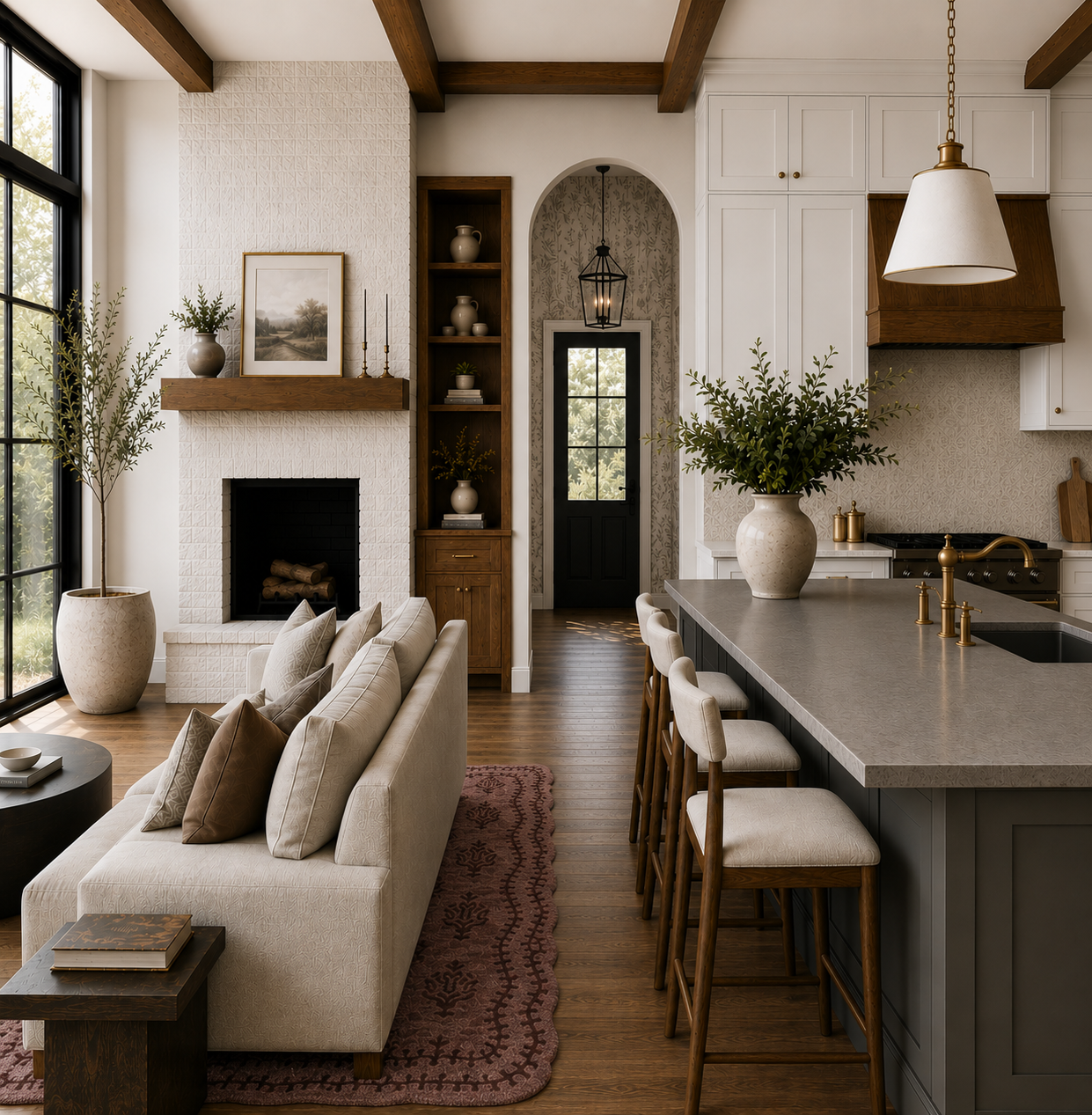
Step 2: Identify Undertones First (Not Colors)
This is where most color decisions succeed or fail.
Before I choose a palette, I ask:
Is the flooring warm, cool, or neutral?
Do fixed materials lean yellow, pink, green, blue, gray, beige?
What undertones repeat throughout the home?
Once undertones are identified, the palette begins to narrow naturally.
I’m not choosing colors yet.
I’m choosing a direction.
Because harmony happens when undertones communicate with one another.
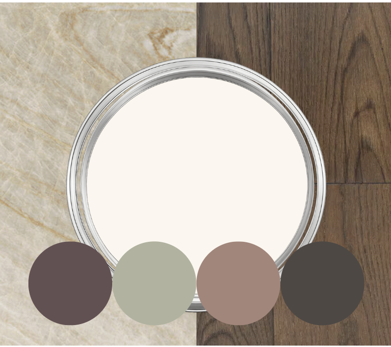
Step 3: Establish the Anchor Color
Every palette needs a starting point.
This is the color that quietly sets the tone for the home.
Usually this becomes:
The primary wall color
The largest visible painted surface
The color that creates continuity between spaces
The anchor isn’t always the most exciting color.
In fact, the strongest anchor colors are often understated.
They create space for contrast elsewhere.
I look for a color that feels:
✓ Balanced
✓ Flexible
✓ Light-responsive
✓ Timeless over trendy
Step 4: Build Contrast With Intention
Once the anchor is selected, I begin layering.
This is where secondary colors come in.
But contrast doesn’t mean making everything different.
I think through:
Light vs dark
Warm vs cool
Visual weight
Room transitions
Moments of rest vs moments of interest
A home should feel like chapters in the same story — not entirely different books.
This is where accent walls, cabinetry, vanities, islands, built-ins, and feature spaces begin to emerge.
Step 5: Walk the Entire Home (On Paper)
This is my favorite step.
I map every room.
Entry.
Kitchen.
Living room.
Bedrooms.
Bathrooms.
Office.
Laundry.
Then I ask:
If you stood in one doorway and looked into the next room… would these spaces still feel connected?
That question changes everything.
Because homes aren’t experienced one room at a time.
They’re experienced in movement.
Step 6: Test in Real Light
No palette is complete until it’s tested.
I look at colors:
Morning light
Afternoon light
Evening light
North-facing rooms
South-facing rooms
Adjacent spaces
Colors shift.
The goal isn’t finding a color that never changes.
The goal is choosing colors that change beautifully.
Step 7: Edit Until It Feels Quiet
This part surprises people.
The final step is usually removing.
Removing extra colors.
Removing unnecessary contrast.
Removing “statement moments.”
Because the strongest palettes rarely shout.
They feel effortless.
They feel calm.
They feel like they were always meant to belong together.
That’s usually the moment I know the palette is finished.
The Goal Was Never Paint
At the end of the process, the result isn’t simply a list of paint colors.
It’s:
A home that flows.
A home that feels layered.
A home that feels collected over time.
A home that feels unmistakably yours.
And it’s why thoughtful color curation changes more than walls — it changes the way a home feels.