

Warm vs. Cool Neutrals: How to Choose the Right Sherwin-Williams Paint Color for Your Home
Neutral paint colors may seem simple at first glance — until you bring home samples and realize one looks yellow, another feels blue, and somehow your “perfect greige” suddenly looks purple at night.
The truth is, not all neutrals are created equal.
Every neutral paint color carries an undertone, and understanding whether a neutral leans warm or cool is one of the most important parts of creating a cohesive, timeless home.
What’s the Difference Between Warm and Cool Neutrals?
Warm neutrals contain undertones like:
Beige
Cream
Yellow
Red
Soft green
Cool neutrals contain undertones like:
Blue
Gray
Violet
Crisp taupe
Neither is “better” — they simply create different moods and react differently to lighting, flooring, and surrounding finishes.
The key is choosing the one that works with your home instead of against it.
Warm Sherwin-Williams Neutral Paint Colors
Warm neutrals create spaces that feel:
Cozy
Inviting
Soft
Timeless
Layered and collected
They tend to pair beautifully with:
Warm wood flooring
Brass accents
Creamy whites
Traditional and transitional interiors
Homes with south or west-facing light
Some of our favorite warm Sherwin-Williams neutrals include:
Agreeable Gray – a soft warm greige with subtle beige undertones
Accessible Beige – warm and grounded without feeling overly tan
Shoji White – creamy and soft with warmth that feels elevated
Alabaster – a warm white that feels timeless and approachable
Neutral Ground – an understated beige with softness and warmth
These colors often feel the most comfortable in everyday living because they naturally soften a space.
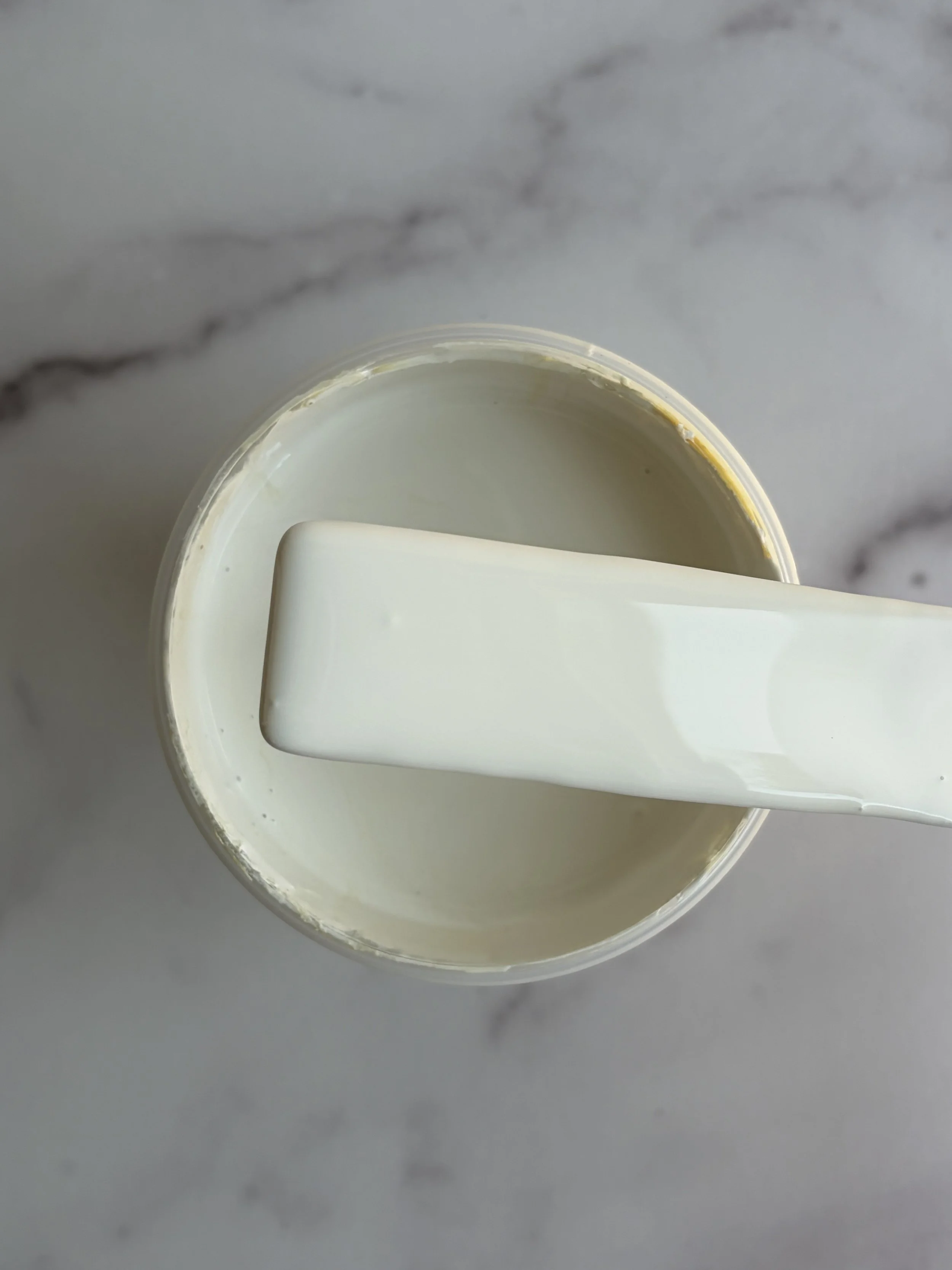
White Flour
SW 7102
(the neutral throughout my entire home)
Cool Sherwin-Williams Neutral Paint Colors
Cool neutrals create spaces that feel:
Crisp
Airy
Calm
Refined
Modern and tailored
They often work well with:
Cool-toned flooring
Marble or concrete finishes
Chrome or matte black hardware
North-facing rooms
Contemporary homes
Some beautiful cool Sherwin-Williams neutrals include:
Repose Gray – a cooler gray with soft depth
Drift of Mist – light and airy with subtle cool undertones
Samovar Silver – soft gray with a calm, muted feel
Misty – a gentle gray-blue neutral
Extra White – a crisp white with cooler clarity
Cool neutrals can feel incredibly clean and sophisticated — but if used in the wrong lighting, they can sometimes feel sterile or flat.
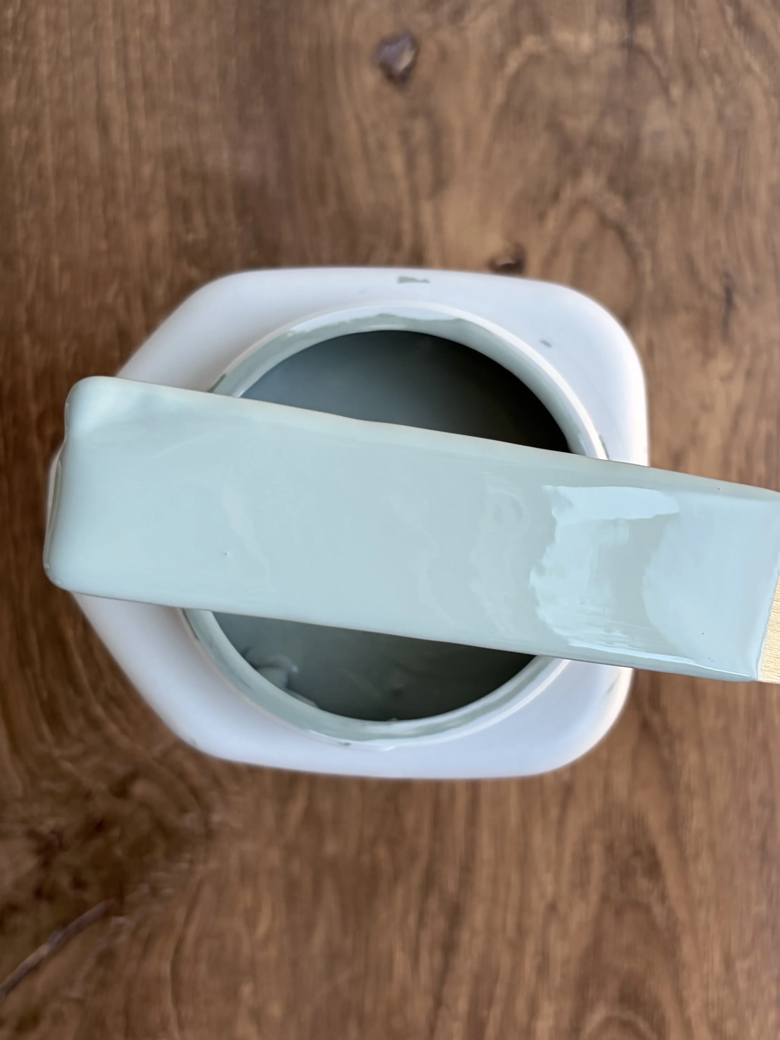
Sherwin-Williams Acacia Haze SW 9132 is considered a colored neutral or a complex neutral green rather than a true neutral.
The Biggest Mistake Homeowners Make
The biggest mistake people make when choosing neutrals is selecting a color without considering the fixed elements in the home.
Your flooring, countertops, cabinetry, tile, brick, and natural lighting all influence how a neutral paint color will appear.
A warm neutral next to cool gray flooring can suddenly look muddy or yellow.
A cool gray paired with red oak floors can appear icy or overly purple.
Paint never exists in isolation.
That’s why two homes using the exact same color can look completely different.
Tips for Choosing the Right Neutral
1. Look at Your Flooring First
Your floors are one of the largest visual surfaces in your home.
Warm wood flooring → usually pairs best with warm neutrals
Cool gray flooring → typically works better with cooler neutrals
If your flooring has strong yellow, orange, pink, or red undertones, ultra-cool grays may fight against it.
2. Pay Attention to Natural Light
Lighting changes everything. A paint color that feels perfect at noon may feel completely different at sunset.
North-facing rooms
Cool, shadowy light
→ Often benefit from warmer neutrals to balance the coolness
South-facing rooms
Warm, bright natural light
→ Can handle both warm and cool neutrals beautifully
East-facing rooms
Warm in the morning, cooler later in the day
West-facing rooms
Cool in the morning, warm golden light in the evening
3. Always Compare Samples Side by Side
Undertones become easier to see in comparison.
Instead of testing one paint color:
Test 3–5 similar shades together
View them morning, afternoon, and evening
Compare them against trim, flooring, and cabinetry
This is usually when hidden undertones finally reveal themselves.
4. Don’t Choose Paint in the Store
Store lighting is rarely accurate.
Large swatches viewed inside your actual home will always tell the real story.
Whenever possible:
Use large peel-and-stick samples
Move them around the room
Test them beside your fixed finishes
5. Think About the Entire Home — Not Just One Room
One of the easiest ways to create a home that feels intentional is through color flow.
Instead of selecting random paint colors room by room, build a palette where the neutrals coordinate with one another.
A well-built whole-home palette creates:
Better visual flow
More cohesive transitions
Timeless layering
Easier decorating decisions later on
This is one of the biggest reasons curated palettes matter.
So… Should You Choose Warm or Cool Neutrals?
The answer depends entirely on:
Your lighting
Your flooring
Your finishes
Your architecture
The feeling you want your home to have
Warm neutrals tend to feel softer, cozier, and more timeless.
Cool neutrals tend to feel cleaner, calmer, and more modern.
Neither is wrong — but choosing intentionally is what creates a home that truly feels cohesive.
At Eastman Design Co., we believe the best homes aren’t built from trendy paint colors.
They’re built from thoughtful color relationships that work together from room to room.
Because when the undertones finally make sense, everything else starts to fall into place.