

What Nobody Tells You About Undertones
Undertones are one of the most talked-about — and least understood — parts of choosing paint.
Most homeowners know they exist.
Few people are actually taught how to see them.
And even fewer are told the truth:
undertones are the reason a “perfect” paint color goes completely wrong in your home.
Let’s break down what nobody tells you — so you can stop second-guessing every sample on your wall.
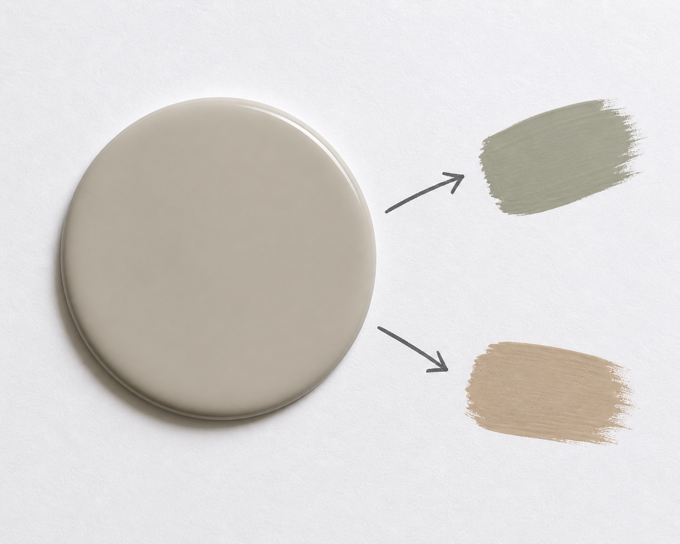
Undertones Aren’t Optional — Every Color Has One
There is no such thing as a truly neutral paint color.
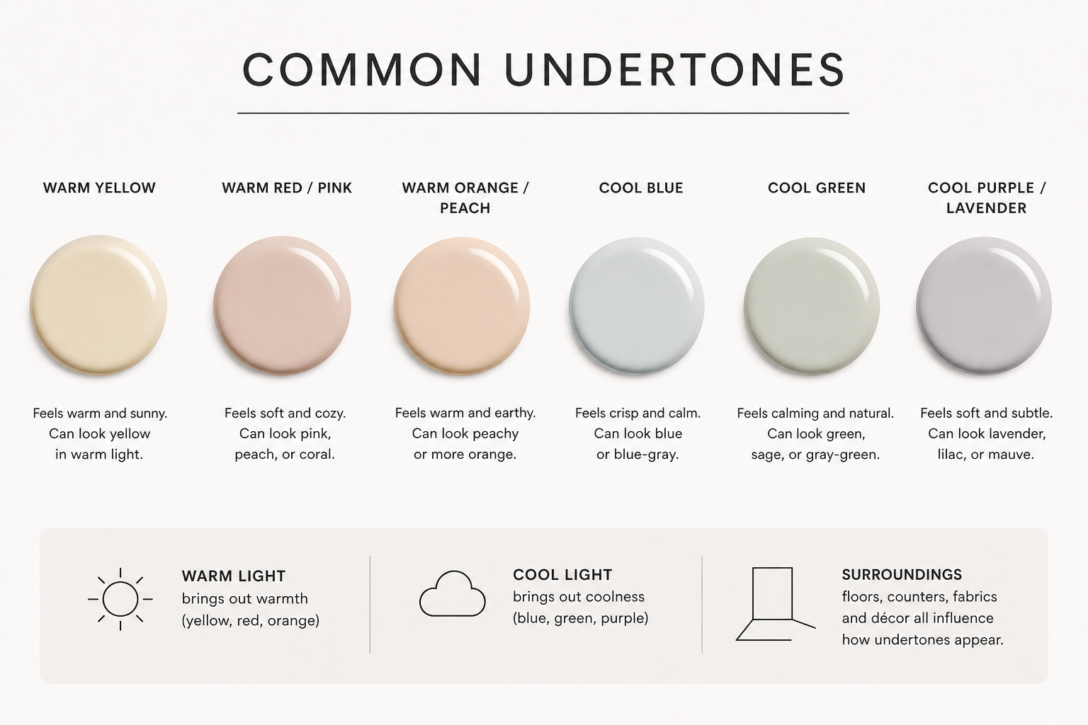
Even the most popular shades like greige, white, or beige are quietly leaning:
warm (yellow, red, orange)
cool (blue, green, violet)
or sometimes a mix that shifts depending on lighting
Take a color like Sherwin-Williams Agreeable Gray SW 7029.
It’s often described as “neutral,” but in reality, it carries a soft warm undertone that can shift slightly green or beige depending on its surroundings.
What no one tells you:
You’re not choosing a neutral — you’re choosing a direction.
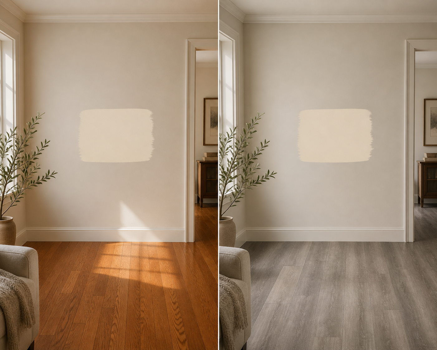
Undertones Don’t Show Up Until It’s Too Late
Here’s where most people get frustrated:
You pick a paint color in the store…
It looks soft, calm, and exactly right.
Then you paint it on your walls and suddenly:
it looks pink
or green
or oddly yellow
Nothing “changed” about the paint —
you just finally gave the undertone enough space to show itself.
Small swatches lie.
Large surfaces tell the truth.
Lighting Doesn’t Just Affect Color — It Reveals Undertones
Lighting is the filter that exposes what’s underneath your paint color.
North-facing rooms pull out cool undertones (blue, gray, green)
South-facing rooms amplify warmth (yellow, beige, cream)
Artificial lighting can completely shift the perception depending on Kelvin
A color you thought was “soft white” can:
turn creamy in warm light
or feel stark and cold in cool light
What no one tells you:
You’re not just choosing a paint color —
you’re choosing how it will react to your lighting.
Your Finishes Will Fight (or Support) Your Undertones
Undertones don’t exist in isolation.
They interact with everything:
flooring (especially red or orange-toned wood)
countertops
cabinetry
furniture
even your décor
This is why a color that looks beautiful in one home feels completely off in another.
For example:
A warm beige next to red oak floors can suddenly look too orange
A cool gray near warm lighting can feel muddy or dull
What no one tells you:
Undertones are relational — not standalone.
“Clashing Undertones” Are the Real Problem
Most people think they’ve chosen the “wrong color.”
What actually happened?
They chose the wrong undertone for their home.
Clashing undertones create:
visual tension
rooms that feel disconnected
that subtle “something is off” feeling you can’t explain
This is the exact reason homes feel disjointed when each room is painted separately without a plan.
This Is Why Whole-Home Color Matters
Undertones don’t just affect one room — they affect the flow of your entire home.
When undertones are aligned:
rooms feel cohesive
transitions feel intentional
your home feels calm and elevated
When they aren’t:
colors compete
spaces feel choppy
nothing quite works together
This is the foundation of how we design at Eastman Design Co.
Every palette is built with undertones in mind first — not last.
How to Actually Identify Undertones (The Right Way)
If you take one thing from this post, let it be this:
Don’t try to guess undertones — compare them.
Here’s how to see what’s really there:
Compare your color to a true white like High Reflective White SW 7757
→ the hidden hue will immediately show itselfLook at 3–5 similar colors side by side
→ undertones become obvious in comparisonMove your sample around your home
→ watch how lighting shifts it throughout the dayStop looking at tiny swatches
→ go bigger, always
The Truth About Undertones
Undertones aren’t the detail —
they are the decision.
They determine:
how your paint looks
how your home feels
and whether everything works together
Once you understand undertones,
you stop guessing… and start choosing with intention.
Final Thought
The biggest mistake isn’t picking the wrong color.
It’s ignoring what’s underneath it.
Because when undertones are right,
everything else falls into place.
If you’ve ever painted a room and thought, “why does this look so different than I expected?”
Now you know.
And once you see undertones clearly —
you won’t be able to unsee them.