

How Lighting Changes Paint Color in Your Home
If there’s one thing that quietly makes or breaks a paint color, it’s lighting.
You can choose the most beautiful shade—one that looks perfect on a swatch, in a store, or even in someone else’s home—and still feel disappointed once it’s on your walls. Not because the color is wrong… but because the light is.
At Eastman Design Co., this is one of the most common disconnects we see. And truthfully, it’s also one of the least talked about parts of choosing paint.
Let’s change that.
Why Paint Color Is Never Static
Paint isn’t a fixed color. It’s reflective.
That means it’s constantly responding to its environment—especially light. The same paint color can shift throughout the day, from room to room, and even depending on the type of bulb you use.
A soft neutral can feel warm and inviting in one space… and suddenly cool or flat in another.
This isn’t a flaw. It’s simply how color works.
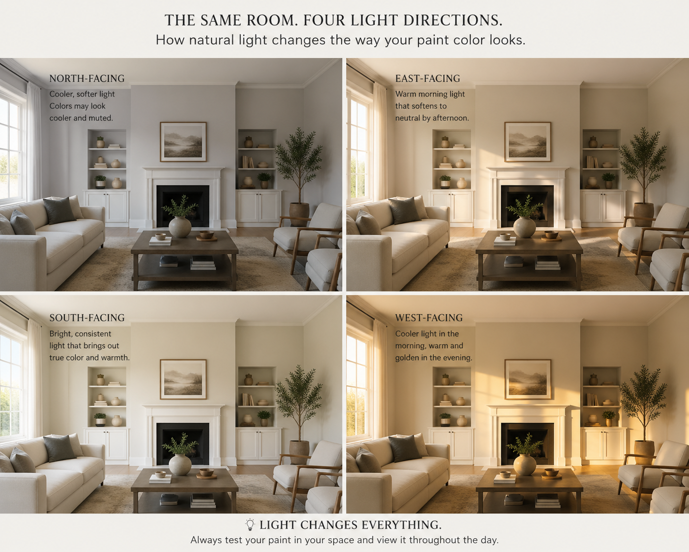
Natural Light: The Biggest Influence
Natural light changes direction, intensity, and warmth throughout the day—and each direction affects paint differently:
North-Facing Rooms
These spaces tend to have cooler, indirect light. Colors can appear slightly muted or take on blue/gray undertones.
→ Warm neutrals (like Accessible Beige or Balanced Beige) help balance the coolness.
South-Facing Rooms
Bright, consistent light with a warm glow. Colors appear truer to life, sometimes even slightly warmer.
→ This is the most forgiving lighting—many colors work beautifully here.
East-Facing Rooms
Warm, golden light in the morning that fades to cooler tones later.
→ Colors may feel soft and warm early, then more neutral by afternoon.
West-Facing Rooms
Cooler light in the morning, but rich and golden in the evening.
→ Paint colors can shift dramatically by the end of the day—often appearing warmer or more saturated.
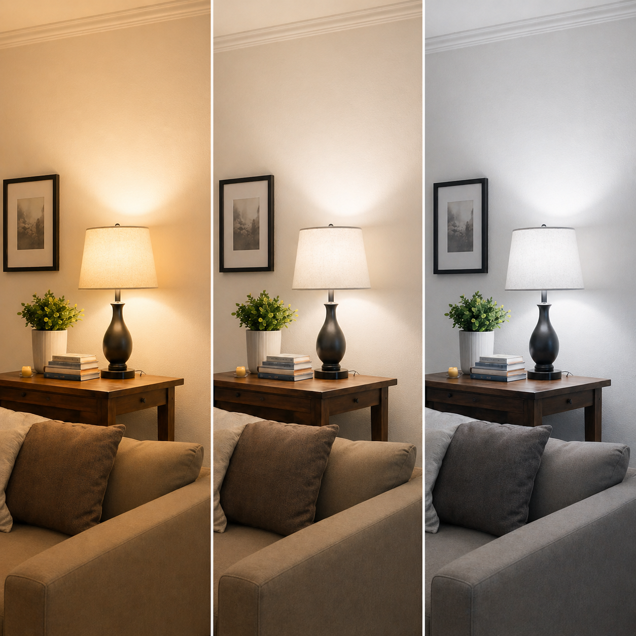
Artificial Lighting: The Hidden Game-Changer
Once the sun goes down, your lighting choices take over completely.
Here’s where many homeowners unintentionally alter their paint color:
Warm Light (2700K–3000K)
Soft, cozy, and slightly yellow.
→ Enhances warmth in paint colors, sometimes pulling out yellow or cream undertones.
Neutral Light (3500K–4000K)
Balanced and clean.
→ Shows paint colors more accurately without heavy warm or cool shifts.
Cool Light (4000K–5000K+)
Crisp and bright with a blue tone.
→ Can make colors feel cooler, sharper, and sometimes less inviting.
A color like Alabaster can feel creamy and soft under warm lighting… but noticeably flatter or cooler under daylight bulbs.
Why Your Paint Looked Different in the Store
Paint stores are designed with bright, even lighting—often closer to neutral or cool daylight.
That means:
Colors look cleaner and more consistent
Undertones are less noticeable
You’re not seeing how it will behave in your home’s unique lighting
Once you bring that same color into your space—with your windows, your bulb choices, and your surroundings—it begins to shift.
The Undertone Factor
Lighting doesn’t just change brightness—it reveals undertones.
A “simple” gray might suddenly look:
Green in one room
Purple in another
Warm beige by evening
That’s because lighting interacts with the hidden pigments inside the color.
This is why we always say:
You’re not just choosing a color—you’re choosing how that color will behave in your home.
How to Test Paint the Right Way
Before committing, test your paint with intention:
Use large samples (at least 8”x8”)
Place them on multiple walls in the room
Compare against a true white, like High Reflective White
Observe throughout the day—morning, afternoon, and evening
View under your actual light bulbs
This step alone can save you from costly repainting—and helps you make a decision with confidence.
The Eastman Approach to Color
At Eastman Design Co., we don’t choose colors in isolation.
We design whole-home palettes that consider:
Natural light in each space
Artificial lighting throughout the home
How colors transition from room to room
How undertones interact across surfaces
Because a well-chosen color isn’t just beautiful—it’s consistent, intentional, and supportive of the way you live in your home.
Final Thought
Lighting is the quiet partner in every paint decision.
When you understand it, everything changes.
Colors feel more predictable. Choices feel easier. And your home begins to feel cohesive in a way that’s hard to explain—but instantly noticeable.
Because in the end, it’s not just about the color on your walls.
It’s about how that color lives in your space.