

What Nobody Tells You About Undertones…
— and why they’re the difference between a home that feels “off” and one that feels effortlessly cohesive
There’s a moment every homeowner experiences.
You find the color. It looks perfect online. It looked beautiful in the store. You paint the wall… step back… and suddenly it feels wrong.
Not bold. Not dramatic. Just… off.
More often than not, this isn’t a color problem.
It’s an undertone problem.
What Undertones Actually Are (Beyond the Basics)
Most people understand that undertones are the subtle hues beneath a paint color — the quiet influence of green, blue, red, or yellow that shapes how a color reads.
But here’s what nobody tells you:
Undertones don’t sit still. They react.
They respond to:
Light (natural vs artificial)
Fixed elements (flooring, countertops, tile)
Surrounding colors (furniture, cabinetry, trim)
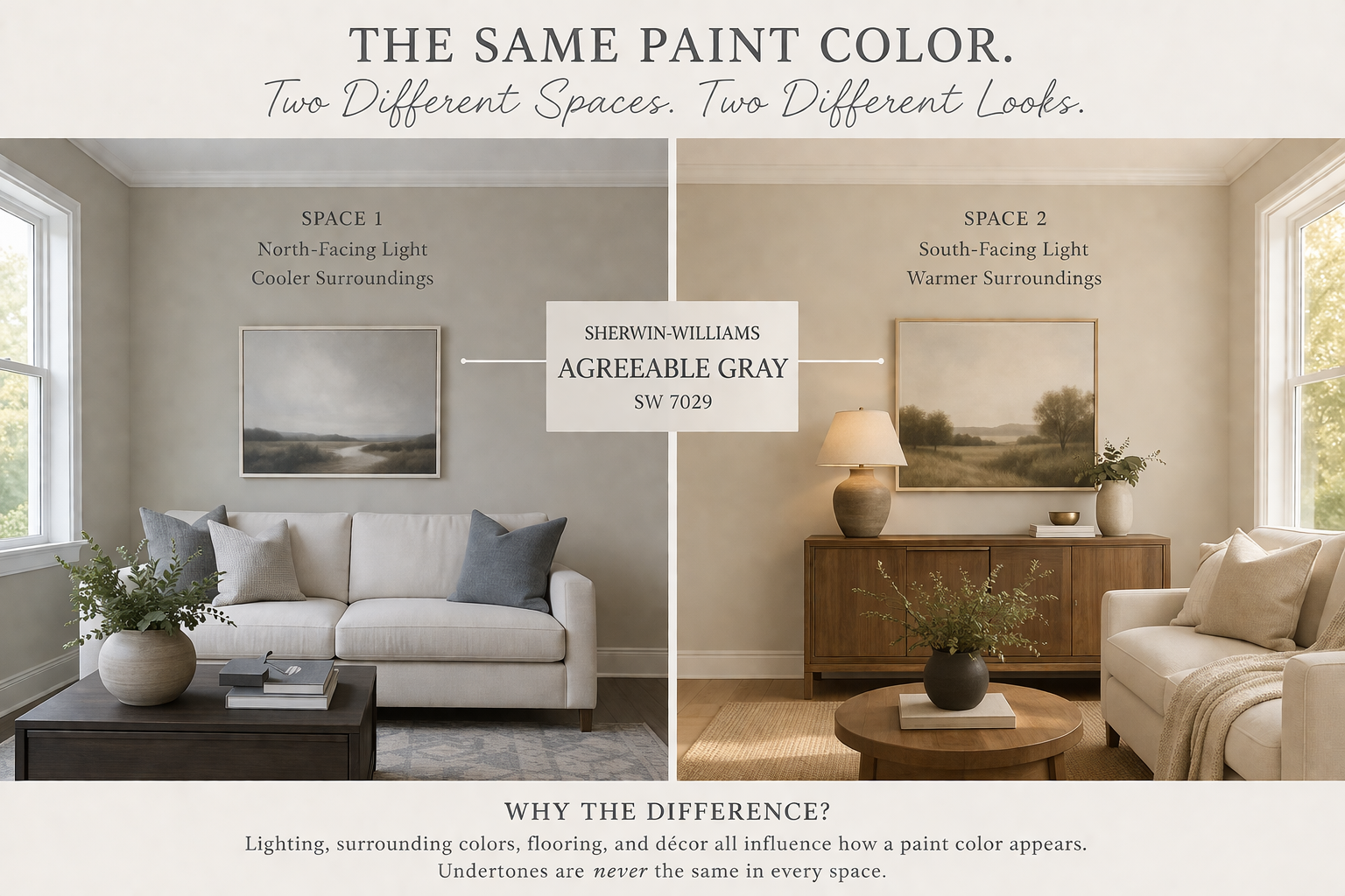
Which means the same paint color can feel completely different from one home to another — or even from one wall to the next.
The Biggest Myth: “It’s Just a Neutral”
There is no such thing as a truly neutral paint color.
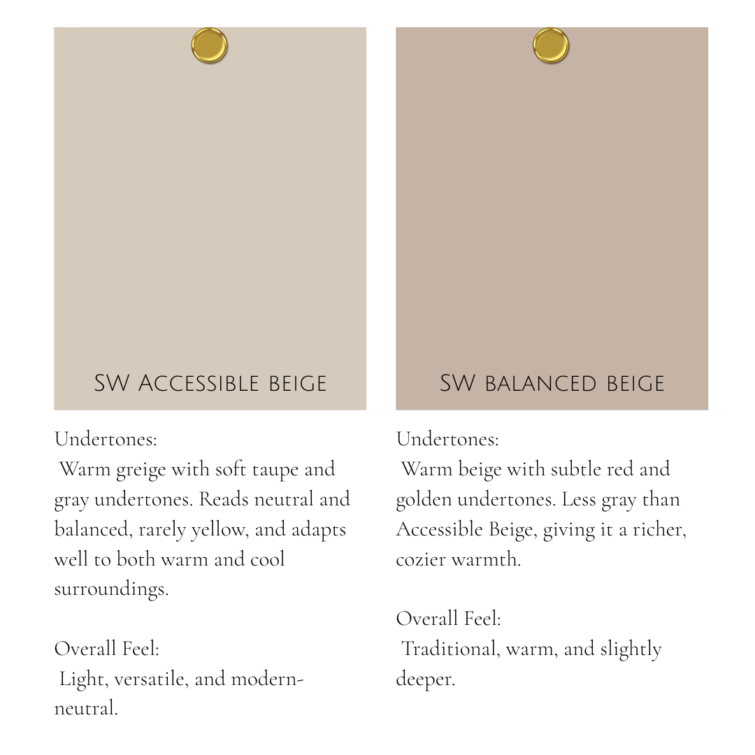
Even the most popular “safe” colors — like
Agreeable Gray or
Accessible Beige —
carry distinct undertones.
Agreeable Gray → warm with subtle green undertones
Accessible Beige → warm with soft taupe/green undertones
And depending on your home, those undertones will either:
✔ blend beautifully
or
✖ completely clash
What Nobody Tells You (The Truth About Undertones)
1. Undertones Are Amplified — Not Hidden
If your flooring has a red undertone and your paint has a green undertone…
they won’t cancel each other out.
They will fight.
And that tension is what makes a room feel visually uncomfortable — even if you can’t explain why.
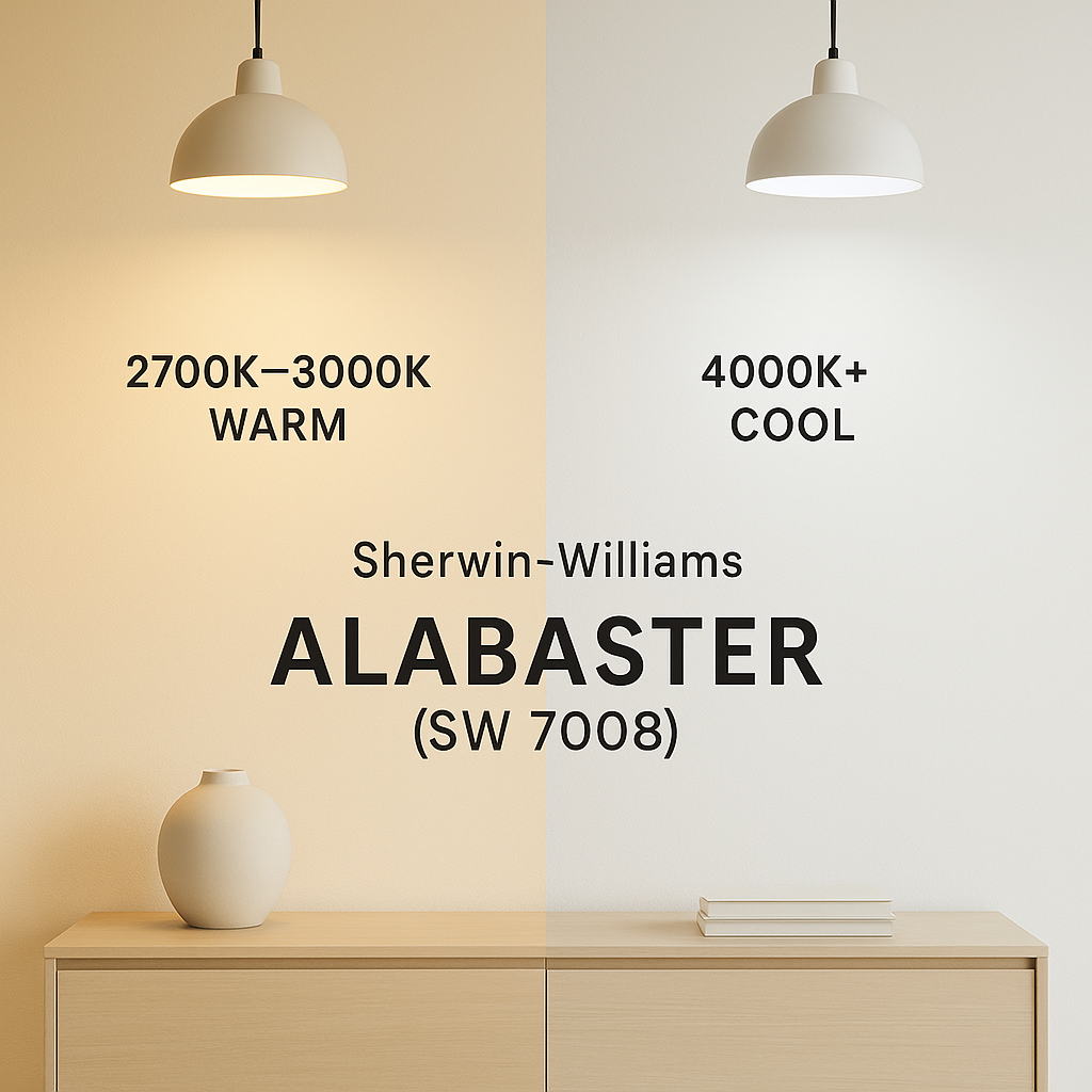
2. Lighting Doesn’t Just Change Color — It Exposes Undertones
A color that feels soft and neutral in daylight can suddenly lean:
yellow under warm bulbs (2700K)
blue or gray under cool lighting (4000K+)
For example, a soft white like
Alabaster
can feel creamy and warm in one space…
and slightly dull or shadowed in another.
Same paint. Different story.
3. Your Fixed Finishes Matter More Than Your Paint
This is the one most people miss.
Your:
floors
countertops
tile
cabinetry
…already have undertones — and they are not changing.
Your paint color doesn’t lead the design.
It responds to what’s already there.
If you ignore this, no color will ever feel quite right.
4. Comparing Colors Is the Only Way to See the Truth
Looking at a single paint swatch tells you almost nothing.
Undertones reveal themselves through comparison.
Place a color next to:
a true white like
High Reflective Whiteor a cooler gray
…and suddenly the hidden hue becomes obvious.
What looked “neutral” may suddenly read:
green
pink
yellow
violet
This is where clarity happens.
5. Undertones Are Why “Copying Someone Else’s Color” Fails
You can take the exact same paint color from a beautiful home online…
and have it look completely different in your own space.
Why?
Because their:
lighting
flooring
exposure
surrounding palette
…are different from yours.
Undertones don’t exist in isolation — they exist in context.
The Eastman Approach to Undertones
At Eastman Design Co., we don’t choose colors individually.
We build whole-home palettes — because undertones don’t just affect one room.
They affect how your entire home flows.
A well-built palette:
aligns undertones across every space
eliminates visual tension
creates a sense of calm and cohesion you can feel immediately
Because when undertones work together…
everything else falls into place.
How to Start Seeing Undertones Like a Designer
If you want to get better at this, start here:
Compare every color to a true white
Always view samples in multiple lighting conditions
Look at your fixed finishes first
Test colors side-by-side — never in isolation
Use large samples (at least 8” or larger)
And most importantly:
Trust what you see — not what the label says.
Final Thought
Undertones are subtle — but they are powerful.
They’re the reason a home feels cohesive…
or quietly disconnected.
And once you start seeing them,
you won’t be able to unsee them.
If your home has ever felt “almost right” but not quite there —
undertones are likely the missing piece.
And when they’re handled with intention?
That’s when a home starts to feel like it was designed — not just decorated.