

How to Build a Color Palette (Like a Designer)
Most homeowners choose paint colors one room at a time.
A color they saw on Pinterest.
A paint chip that looked pretty in the store.
A trending green everyone seems to be using.
The result?
Beautiful individual rooms that don't necessarily feel connected when viewed together.
Designers approach color differently.
Instead of selecting colors room-by-room, they build an intentional palette that creates flow throughout the entire home. Every color has a purpose. Every shade relates to the next. Every space feels like it belongs to the same story.
The good news?
You don't need a design degree to create a palette like a designer.
You simply need a process.
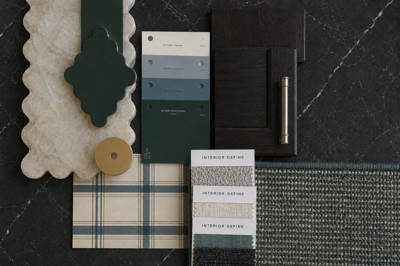
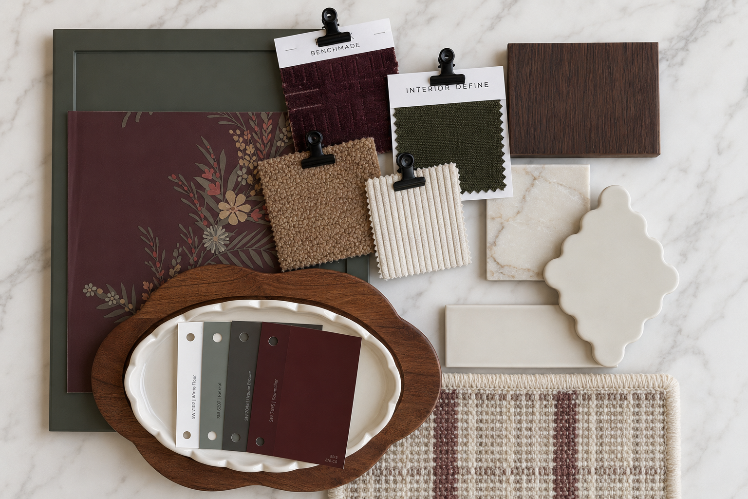
Step One: Start With Your Fixed Elements
Before looking at paint colors, look at what already exists.
Your flooring.
Countertops.
Cabinetry.
Brick.
Tile.
Stone.
Wood tones.
These elements often cover the largest visual surfaces in a home and are the most expensive to change.
A designer doesn't choose paint first.
They choose paint that works with these materials.
Take a moment to identify the dominant undertones in your home.
Are your floors warm and golden?
Do your countertops lean cool gray?
Is your stone fireplace creamy beige or charcoal?
Understanding these undertones becomes the foundation of every color decision that follows.
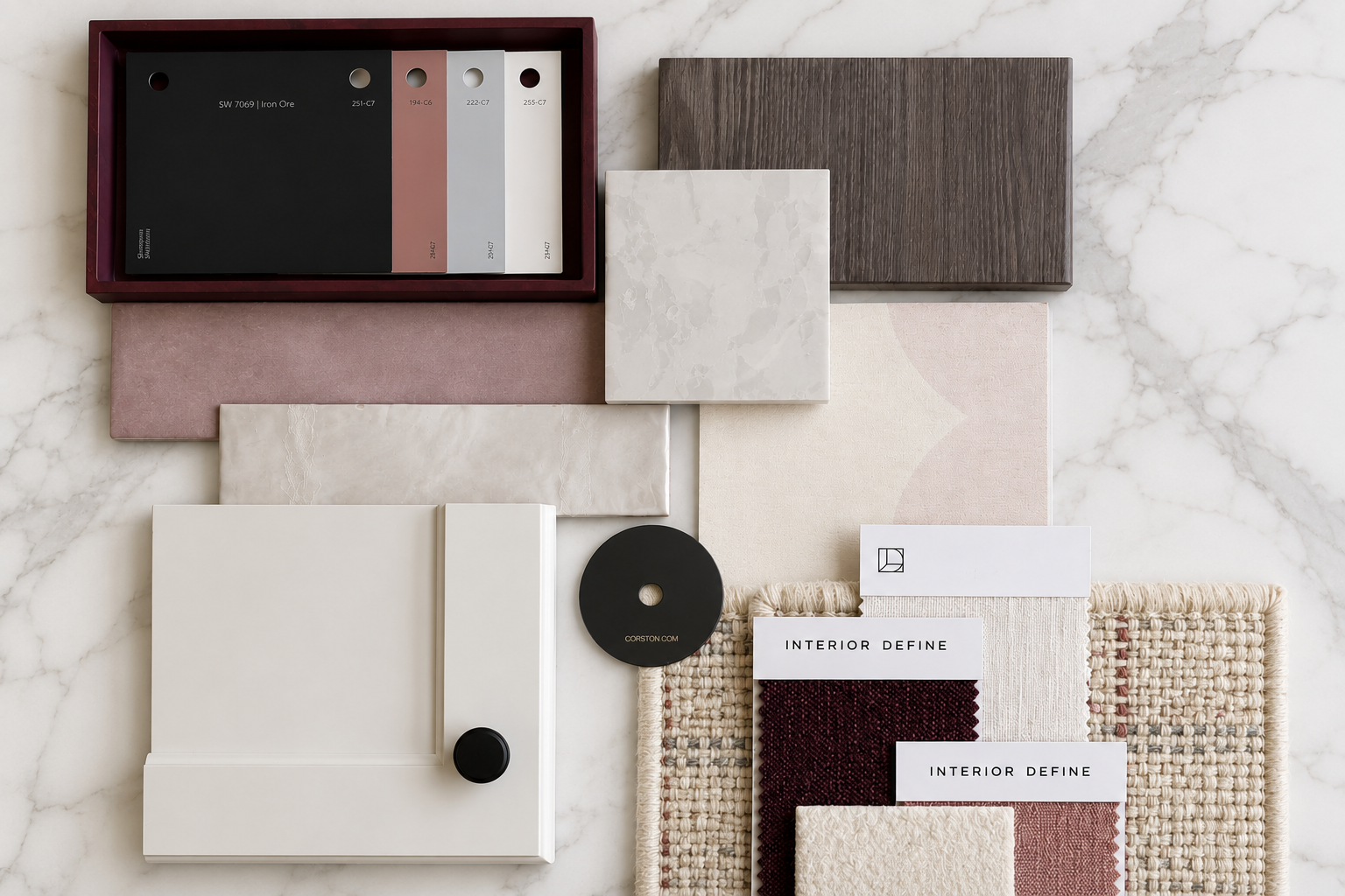
Step Two: Choose Your Anchor Color
Every designer palette begins with an anchor.
This is the color that quietly sets the tone for the entire home.
Typically, it becomes:
The primary wall color
The largest painted surface
The color that creates continuity from room to room
Think of it as the backdrop for everything else.
The best anchor colors are rarely dramatic.
Instead, they're balanced, versatile, and timeless.
Colors like:
Sherwin-Williams Agreeable Gray SW 7029
Sherwin-Williams Alabaster SW 7008
Sherwin-Williams Evergreen Fog SW 9130
Sherwin-Williams Accessible Beige SW 7036
These colors have enough personality to feel intentional without overwhelming the home.
Step Three: Build Around Undertones
This is where most homeowners get stuck.
They choose colors they like individually rather than colors that relate to one another.
Designers look for undertone relationships.
If your anchor color leans warm, your supporting colors should generally live within the same family.
If your anchor carries subtle green undertones, introducing a complementary green elsewhere in the home often creates a natural sense of cohesion.
The goal is not matching.
The goal is harmony.
Colors should feel connected without feeling identical.
Step Four: Add Supporting Colors
Once the anchor is established, designers begin adding depth.
Most successful whole-home palettes include:
A Light Color
Used for trim, ceilings, or cabinetry.
This provides contrast and brightness.
A Mid-Tone Color
Used in secondary rooms, built-ins, islands, or furniture.
This adds visual interest while maintaining flow.
A Deep Color
Used sparingly for contrast.
Think:
Interior doors
Kitchen islands
Built-ins
Accent furniture
Powder rooms
These darker colors create moments of depth and sophistication throughout the home.
Step Five: Think About the Entire Home
One of the biggest differences between homeowners and designers is perspective.
Homeowners often evaluate colors within a single room.
Designers evaluate colors from room to room.
Stand in your foyer.
Look into adjoining spaces.
Consider what colors you'll see simultaneously.
The palette should unfold naturally as you move through the home.
No sudden surprises.
No rooms that feel disconnected from the story.
Just a gradual progression of colors that feels intentional and effortless.
Step Six: Limit the Number of Colors
More colors do not create more interest.
In fact, the opposite is usually true.
Many designer homes use only:
One primary wall color
One trim color
Two to three supporting colors
One darker accent color
That's it.
The richness comes from layering materials, textures, fabrics, woods, metals, and lighting—not from introducing a new paint color in every room.
Restraint is often what makes a home feel elevated.
Step Seven: Test Everything in Natural Light
Even the most beautiful palette can fall apart if it isn't tested properly.
Paint colors shift dramatically throughout the day.
They change based on:
Window direction
Time of day
Flooring
Surrounding colors
Artificial lighting
Always sample colors in multiple rooms before making final decisions.
A color that looks perfect in a north-facing bedroom may feel completely different in a sun-filled south-facing living room.
Designers never rely solely on paint chips.
They rely on observation.
The Designer Secret
The most beautiful homes aren't filled with perfect individual colors.
They're filled with colors that work together.
A successful palette creates:
Flow
Comfort
Balance
Visual continuity
Timeless appeal
When every color supports the next, the entire home feels more intentional.
And that's what great design really is.
Not a collection of beautiful rooms.
A collection of connected ones.