

Designing a Home “From the Floor Up”
When most homeowners begin designing a space, they immediately start with paint colors.
But you should begin somewhere else entirely:
The floors.
Because flooring is one of the largest visual surfaces in a home — and one of the most permanent. It quietly influences every color, texture, and material surrounding.
The truth is:
A home rarely feels cohesive because of one beautiful paint color alone.
It feels cohesive because every element relates to the foundation beneath it.
Why Flooring Matters More Than Most People Realize
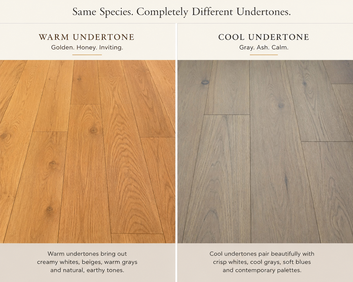
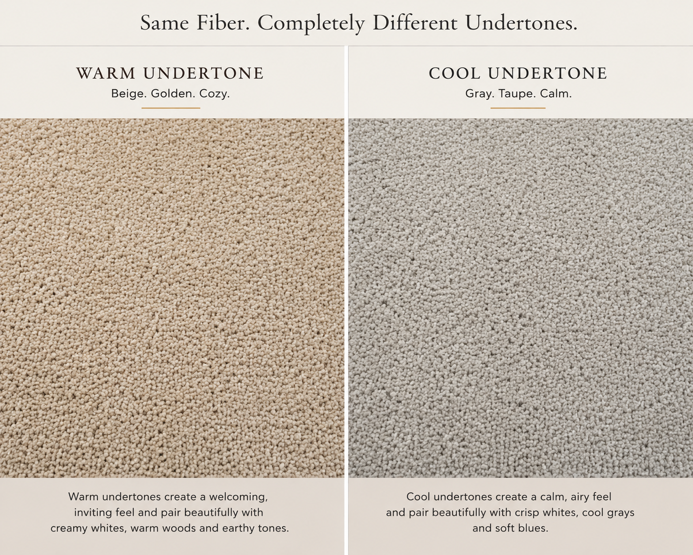
Your floors carry undertones.
Some lean warm.
Some lean cool.
Some pull pink, golden, taupe, gray, or even slightly green depending on the light.
And those undertones directly affect:
how paint colors appear
how cabinetry feels
how lighting reflects
how rugs and furniture coordinate
whether a space feels balanced or disconnected
This is why a paint color that looked beautiful online may suddenly feel “off” in your home.
It was never chosen in relationship to the flooring.
The Eastman Design Co. Approach
At Eastman Design Co., we design spaces “from the floor up.”
That means we first study the fixed elements of the home:
flooring
tile
countertops
stonework
cabinetry
natural lighting
These are the pieces that anchor the space.
From there, we begin curating colors that intentionally support those materials instead of competing against them.
Because when undertones are aligned properly, something shifts.
The home begins to feel:
softer
calmer
more intentional
more elevated
naturally cohesive
Not because everything perfectly matches —
but because everything visually belongs together.
Floors Set the Emotional Tone of a Home
Warm oak flooring creates an entirely different feeling than cool gray flooring.
One may call for creamy whites and earthy neutrals.
The other may need cleaner grays, cooler taupes, or softened contrast.
The floor is often the quietest design decision in the room —
but it influences every other decision afterward.
This is why we never believe in selecting paint colors in isolation.
A truly timeless palette considers:
undertones
light exposure
contrast
visual weight
material relationships
whole-home flow
Designing for Flow, Not Just Individual Rooms
One of the biggest mistakes homeowners make is designing rooms separately instead of designing the home as a whole.
A beautiful kitchen means very little if it visually disconnects from the living room beside it.
At Eastman Design Co., we curate homes with continuity in mind.
We ask:
How does this room transition into the next?
Do the undertones remain cohesive?
Does the palette feel grounded throughout the home?
Is there visual consistency from one space to another?
This is what creates that elevated, designer-quality feeling people often can’t quite explain.
The home simply feels right.
Timeless Design Starts with Intentional Foundations
Trends come and go.
But homes that feel warm, balanced, and thoughtfully layered tend to share one thing in common:
Their design decisions were made intentionally from the beginning.
That’s why we believe great design starts from the floor up.
Because when the foundation is right, everything above it begins to fall beautifully into place.