

Why Curated Color Palettes Matter (and Why Your Whole Home Deserves One)
What Is a Curated Color Palette?
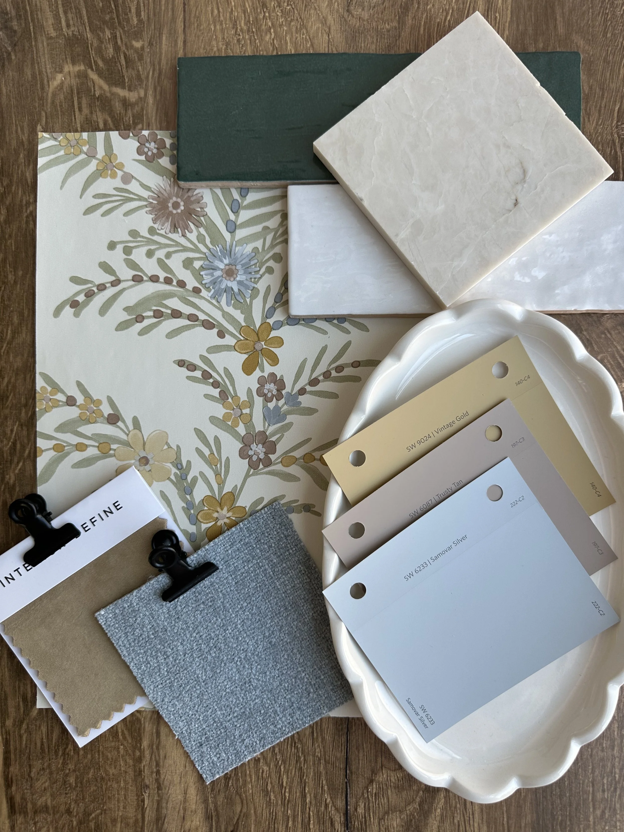
A curated color palette is a thoughtfully selected group of colors designed to work together harmoniously. Instead of picking paint colors room by room based on trends or impulse, a curated palette is intentional—it considers undertones, lighting, materials, and how each space connects to the next.
Think of it as the foundation of your home’s visual identity.
Design isn’t just about choosing pretty things—it’s about creating a feeling. And nothing shapes that feeling more than color. At its core, a well-designed home isn’t a collection of random rooms; it’s a cohesive story. That’s where curated color palettes and whole-home color planning come in.
Why Random Color Choices Fall Short
It’s easy to fall into the trap of choosing colors individually:
A trending gray for the living room
A soft green for the kitchen
A bold navy for the bedroom
Individually, these choices may be beautiful. But together? They can feel disconnected, choppy, and even visually overwhelming.
Without cohesion, your home loses flow—and that subtle sense of calm that comes from everything feeling “just right.”
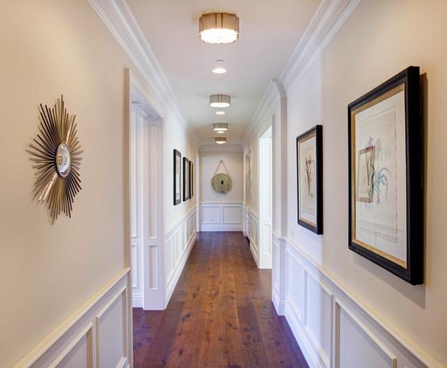
Whole-home color design means every color decision is made with the entire house in mind. Each shade complements the next, creating a seamless transition from room to room.
1. Creates Flow and Continuity
When colors relate to each other, your eye moves naturally through the space. There’s no visual stopping point—just a smooth, intentional flow that makes your home feel larger and more connected.
2. Enhances Natural Light and Undertones
Every color has an undertone, and every room has different lighting. A curated palette accounts for both. This prevents the common frustration of a color looking perfect in one room—and completely different in another.
3. Elevates the Overall Design
Cohesion is what separates a professionally designed home from a pieced-together one. Even simple spaces feel elevated when the color story is consistent and intentional.
4. Simplifies Every Design Decision
When you have a defined palette, everything else becomes easier—furniture, rugs, cabinetry, décor. You’re no longer guessing if something will “work.” You already know it will.
The Emotional Impact of Color Cohesion
Your home should feel like a retreat—calm, grounded, and reflective of you. Disjointed color choices can create subtle tension, even if you can’t immediately identify why.
A curated palette creates:
A sense of calm and balance
Visual clarity (less mental clutter)
A home that feels intentional, not accidental
Instead of asking, “What color should this room be?”
Start asking, “How should my home feel from start to finish?”
From there, build a palette that supports that feeling:
A dominant base (your main neutral)
Supporting tones (secondary colors used throughout)
Accent colors (small moments of contrast and personality)
This is where thoughtful design begins.
The Eastman Design Co. Approach
At Eastman Design Co., color isn’t an afterthought—it’s the starting point. Every palette is curated with intention, designed to flow effortlessly from room to room while working with your home’s lighting, finishes, and natural character.
Because a home that flows well doesn’t just look better—it feels better.
Anyone can pick a paint color.
But creating a home that feels cohesive, elevated, and truly yours?
That starts with a curated color palette—and a whole-home vision.