What to Do When Paint Colors Don't Match
You spent hours choosing paint colors.
You held up sample cards.
You compared Pinterest photos.
You painted swatches on the wall.
And somehow, once everything is in place, nothing feels quite right.
The walls feel disconnected from the flooring.
The cabinetry seems to belong in a different house.
The paint color you loved in one room suddenly feels wrong in the next.
If you've ever found yourself wondering why your paint colors don't match, you're not alone.
The good news? Most of the time, the problem isn't the color itself.
It's the relationship between the colors.
Start by Looking at Undertones
Paint colors are rarely just gray, beige, white, or green.
Every color carries an undertone beneath the surface.
A white may lean creamy yellow.
A greige may have a subtle green cast.
A taupe may carry pink or violet undertones.
When two colors have competing undertones, they often feel disconnected—even if they look similar at first glance.
For example:
A warm creamy white can feel off next to a cool gray floor.
A pink-beige wall can clash with a yellow-beige countertop.
A blue-green paint may look muddy next to cabinetry with strong olive undertones.
When a room feels "off," undertones are usually the first thing I investigate.
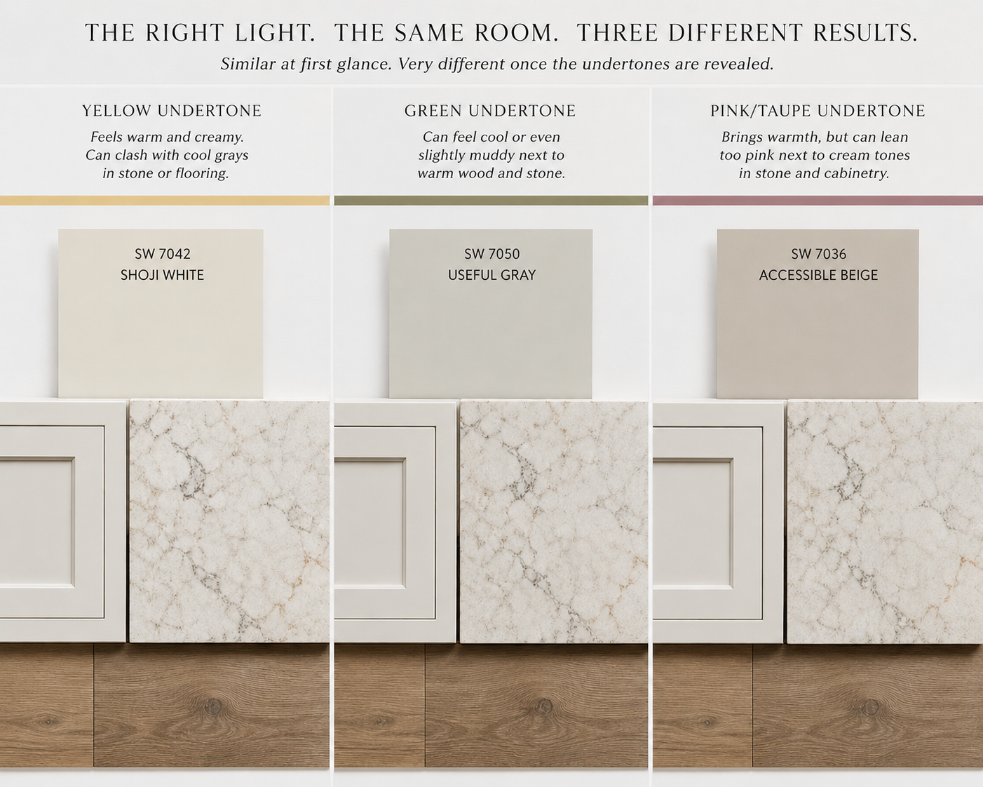
Evaluating undertones for three of Sherwin William’s most popular neutrals
Evaluate the Fixed Finishes First
One of the biggest mistakes homeowners make is choosing paint before evaluating everything that isn't changing.
Your flooring, countertops, tile, brick, stone, and cabinetry all have color influence.
These materials often occupy more visual space than the paint itself.
Instead of asking:
"What paint color do I like?"
Ask:
"What paint color works with what already exists?"
The most successful palettes start with the fixed finishes and build outward from there.
Check the Lighting
A paint color that looks beautiful in one room may look completely different in another.
Natural light changes throughout the day.
North-facing rooms often feel cooler.
South-facing rooms tend to feel warmer.
East-facing rooms receive bright morning light.
West-facing rooms become warmer in the afternoon and evening.
Artificial lighting matters, too.
A warm 2700K bulb can enhance creamy undertones, while cooler lighting can make a color appear more gray or muted.
Before abandoning a paint color, view it at multiple times throughout the day.
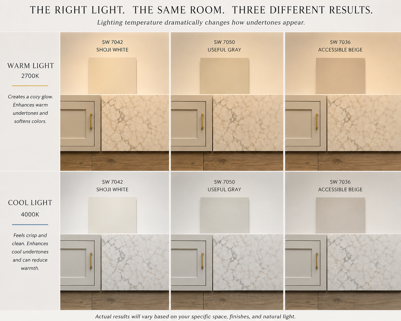
Evaluating lighting tones for three of Sherwin William’s most popular neutrals
Stop Evaluating Rooms Individually
Many homeowners select colors room by room.
The result is a collection of beautiful spaces that don't necessarily feel connected.
A cohesive home doesn't require every room to be painted the same color.
Instead, it relies on shared relationships.
Similar undertones.
Repeating accent colors.
Consistent wood tones.
Coordinating metals.
Intentional transitions from space to space.
When viewed together, the home should feel like one complete story rather than a series of separate chapters.
Create a Color Hierarchy
Designers often organize palettes into three categories:
The Foundation Color: This is typically the main wall color that appears throughout much of the home.
Supporting Colors: These add variety while maintaining compatibility with the foundation color.
Accent Colors: These create depth and personality through cabinetry, furniture, textiles, artwork, and smaller painted moments.
When every color has a role, the palette feels intentional rather than random.
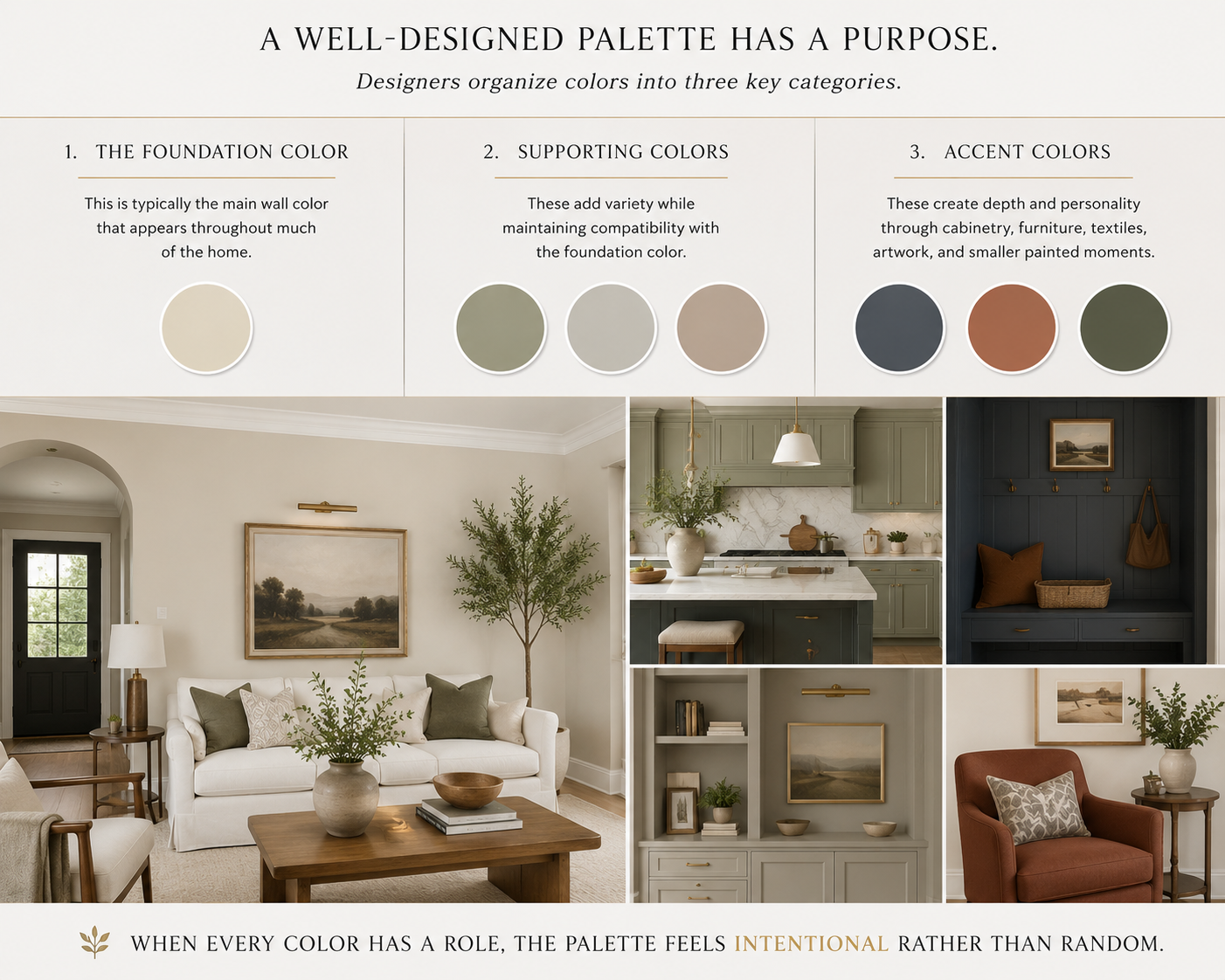
A visual representation of a well-designed palette
When in Doubt, Simplify
If your colors aren't working together, adding more colors rarely fixes the problem.
Often the solution is editing.
Reduce the number of competing paint colors.
Limit accent colors.
Repeat successful tones more often.
Allow materials and textures to provide variety.
The most cohesive homes are rarely the most colorful.
They're simply the most intentional.
The Bottom Line
When paint colors don't match, the issue is rarely about finding a "better" color.
More often, it's about understanding undertones, evaluating fixed finishes, considering lighting, and creating relationships between rooms.
A beautiful home isn't built one paint color at a time.
It's built by creating a palette where every color supports the others.
That's where true cohesion begins.
This topic would pair well with a blog image showing three paint swatches that appear similar on their own but reveal conflicting undertones when placed beside flooring, cabinetry, and countertop materials.